
Color psychology explores how different hues can influence human emotions and perceptions. Each color carries unique meanings and associations that can significantly affect the ambiance of a space. For instance, warm colors such as reds and yellows are often associated with energy and enthusiasm, making them suitable for areas where social interactions occur, like living rooms or dining areas. Conversely, cool colors like blues and greens are linked to tranquility and relaxation, making them ideal for bedrooms and bathrooms. Individuals’ reactions to colors may vary based on personal experiences and cultural context. For example, while white symbolizes purity and simplicity in many Western cultures, it may represent mourning in some Eastern traditions. Therefore, it is crucial to consider not only general color associations but also how specific colors resonate with you personally and the cultural significance they may carry.
When choosing a color scheme for your home, it is beneficial to start with the emotions you wish to evoke in each room. Think about the activities taking place and how colors can enhance those experiences. For example, yellows can incite creativity and stimulate conversation, making them a choice for dedicated workspaces. In contrast, earthy tones can foster a sense of grounding and stability, making them suitable for spaces intended for relaxation. Utilizing color psychology, you can create a harmonious environment that meets your emotional and functional needs.
In summary, understanding color psychology can significantly enhance the development of your home’s atmosphere. By identifying the ideal colors that align with your personal taste and the intended use of each space, you can create an inviting and emotionally supportive habitat. Careful consideration of color choices, infused with a knowledge of their psychological impact, can lead to a cohesive and aesthetically pleasing home design.
Assessing Your Space
Choosing the right color scheme for your home begins with a thorough assessment of your space. Understanding the unique characteristics of your environment can significantly impact your color choices. Start by evaluating the natural light in each room. Observe how sunlight filters through windows at different times of the day and how it interacts with existing colors and furnishings. Rooms with ample natural light often allow for more bold and vibrant hues, whereas dimly lit spaces may benefit from lighter shades that enhance brightness.
Next, consider the size and layout of the rooms you are decorating. Larger areas may accommodate darker colors or saturated tones, adding depth and a sense of intimacy. Conversely, small spaces typically thrive with lighter shades, creating an illusion of openness and airiness. The shape of the rooms is also important; long, narrow spaces may feel more balanced with softer tones that enhance cohesion.
Your existing furnishings, from upholstery to artworks, should also influence your color scheme decisions. It is essential to establish a cohesive look by selecting colors that complement or coordinate with your current pieces. Neutral palettes can serve as a versatile backdrop, allowing furnishings to stand out, while bold accent colors can be introduced through accessories such as cushions, throws, or artwork.
Additionally, it is beneficial to consider the function of each room. For instance, calming colors are ideal for bedrooms, while lively tones may be more suitable for social areas like living rooms or kitchens. Taking all these factors into account will help you develop a color scheme that not only reflects your personal style but also enhances the functionality and aesthetic appeal of your space.
Choosing a Color Palette
Selecting a color palette for your home is an essential step in creating a harmonious and aesthetically pleasing environment. Understanding the basics of color theory can significantly aid in this endeavor. The color wheel, a fundamental tool in color theory, illustrates the relationships between colors. It can help you visualize how colors interact with each other, paving the way for informed decisions.
One effective approach is to consider complementary colors, which are located opposite each other on the color wheel. These pairings tend to create a striking visual contrast, enhancing the vibrancy of each color. On the other hand, using analogous colors, which are next to each other on the wheel, can foster a serene and cohesive atmosphere. This is particularly useful in open-concept homes where spaces flow into one another.
When choosing your color palette, it is important to maintain a cohesive look throughout various rooms in your home. To achieve this, consider selecting a dominant color and then incorporating accent colors that complement it. A common strategy is to use a 60-30-10 rule; where 60% of a room is painted in the dominant color, 30% in a secondary color, and 10% in an accent color. This balance can provide visual interest without overwhelming the senses.
Additionally, your personal style should always influence your color choices. Whether you gravitate towards warm earth tones, cool blues, or vibrant hues, ensure that your palette reflects your personality and lifestyle. Gathering inspiration from design magazines, online platforms, or even fabric swatches can help articulate your vision.
Testing and Implementation
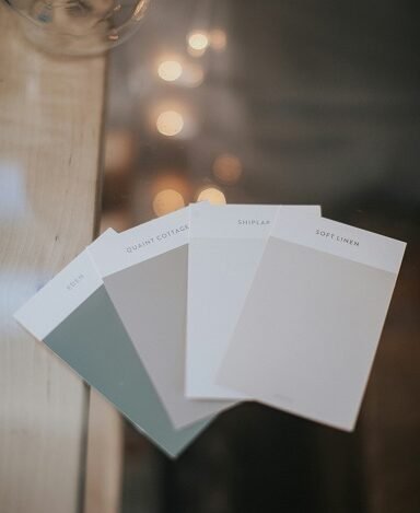
Once you have selected a color scheme for your home, the next critical step involves testing and implementing your choices effectively. A noteworthy first step is to collect paint samples from your selected palette. Most paint retailers provide small sample sizes that allow you to apply patches on various walls. This method helps to visualize how the colors look in different lighting conditions throughout the day, as natural light can significantly alter the perception of color.
In addition to paint samples, creating mood boards can be an effective way to bring your color scheme together. A mood board can include swatches of paint, fabric samples, and images that evoke the feeling you wish to achieve in your space. By seeing your color combinations alongside furniture and decor pieces, you can better assess their compatibility. Digital tools and applications are available to assist in this creative endeavor, making it easier to rearrange and visualize your ensemble.
Seek feedback from friends or family regarding your color choices, as different perspectives can provide valuable insight. Others may notice elements that you might overlook, helping to refine your selection further. Don’t hesitate to adjust your choices based on this feedback and your observations during the testing phase.
Lastly, it is essential to approach the application of your color scheme with patience and adaptability. While the excitement to complete the project can be overwhelming, taking your time ensures you achieve the desired results. It might take several coats of paint to reach the flawless finish envisioned, and it is advisable to remain open to modifications if a particular shade does not translate as expected on the walls. Ultimately, this process culminates in a well-thought-out space that embodies both comfort and aesthetic appeal.