
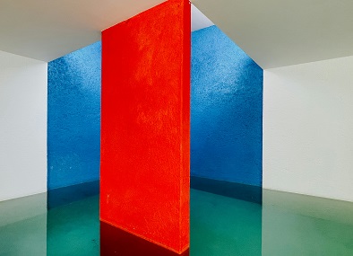
Color combinations play an integral role in home interiors, influencing not just the aesthetic appeal but also the emotional ambiance within a space. The choice of color can set the mood of a room, making it feel cozy, energizing, or calming. For instance, warm colors such as reds and oranges can evoke feelings of warmth and intimacy, while cool colors like blues and greens tend to create a serene and tranquil environment. Understanding the psychological impacts of colors is essential for anyone looking to enhance their living space.
Additionally, color combinations can also affect perceptions of space. Lighter hues can make a room appear larger and more open, while darker shades can create a sense of enclosure, making a space feel more intimate. This aspect of color theory is particularly useful for small rooms or areas that require a sense of depth. By utilizing various tones and shades effectively, interior designers can manipulate the visibility and dimensions of a space to achieve desired outcomes.
Moreover, colors serve as a direct reflection of personal style. An individual’s color preferences speak to their personality and can encapsulate their tastes and choices. It is crucial for homeowners to select color schemes that resonate with their identity and lifestyle, as this contributes significantly to the overall harmony of the home. When executed thoughtfully, color combinations can transform mundane interiors into vibrant and inviting spaces that are both functional and aesthetically pleasing.
By comprehensively understanding the principles of color theory and the significance of thoughtful selection, one can create an environment that is not only visually appealing but also profoundly connected to the occupants’ feelings and preferences.
Understanding Color Theory
Color theory is a foundational aspect of interior design, providing insight into how different colors interact and influence a space’s ambiance. At its core, color theory is based on the color wheel, a visual representation that categorizes colors into primary, secondary, and tertiary groups. The primary colors, red, blue, and yellow, serve as the building blocks for creating other colors. By mixing primary colors, one can achieve secondary colors like green, orange, and purple. Tertiary colors arise from the combination of primary and secondary colors, adding depth and variety to the spectrum.
Colors can also be classified as warm or cool. Warm colors, such as reds, oranges, and yellows, evoke feelings of energy and comfort, making them ideal for spaces intended for social interaction. Conversely, cool colors—such as blues, greens, and purples tend to create a calm and tranquil atmosphere, suitable for relaxation zones. Understanding the psychological effects of these categories helps designers create spaces that cater to the intended emotional experience.
Color harmony is another critical concept in color theory. It refers to the aesthetic balance achieved by combining colors in a pleasing way. Complementary color schemes, which involve pairing colors opposite each other on the color wheel, can create vibrant contrasts that energize a room. Analogous color schemes, which involve using colors that are next to each other on the wheel, can generate a serene and cohesive feel. Furthermore, the emotional connotations associated with different colors can greatly influence how a space is perceived. A well-placed color can inspire creativity, serenity, or even comfort, significantly affecting the overall experience within a home.
Popular Color Schemes and Their Appeal
When it comes to designing home interiors, selecting the right color scheme plays a pivotal role in creating the desired ambiance. Among the most popular color schemes are monochromatic, analogous, complementary, and triadic, each offering unique benefits and visual appeal.
The monochromatic scheme utilizes various shades and tones of a single color, fostering a sense of harmony and elegance. This approach can be particularly effective in smaller rooms, where the absence of contrasting colors can help create the illusion of spaciousness. For instance, a palette of soft blues can introduce a calming atmosphere in a bedroom, while deeper blues can add sophistication and depth.
Another widely embraced scheme is the analogous color scheme, which comprises colors that are adjacent on the color wheel. This arrangement is visually appealing and creates a peaceful and cohesive look throughout a space. For example, combining greens, yellows, and blues can result in a fresh and lively living area. This scheme is versatile, allowing homeowners to experiment with different intensities of chosen hues to evoke various emotions.
On the other hand, the complementary color scheme involves contrasting colors situated opposite each other on the color wheel, such as blue and orange or purple and yellow. This scheme is engaging and dynamic, making it appropriate for areas meant for social interaction. In a dining room, incorporating complementary colors can enhance the vibrancy, making the space feel more alive and stimulating.
Lastly, the triadic color scheme forms a triangle on the color wheel, incorporating three colors spaced equidistantly. This balanced approach provides an energetic yet harmonious feel, ideal for family rooms or playrooms. For example, pairing red, yellow, and blue can give a warm, cheerful environment, while adding neutrals can soothe the vibrancy.
Each color scheme not only contributes to aesthetic appeal but also shapes the overall atmosphere of a home, highlighting the importance of color choice in interior design.
Best Color Combinations for Living Rooms
The living room is often regarded as the heart of the home, serving as a space for family gatherings and social interactions. Selecting the best color combinations for this area not only enhances its visual appeal but also influences the mood and ambiance of the space. When considering color schemes, factors such as the size of the room, the availability of natural light, and the desired atmosphere must be taken into account.
One popular combination that works well in many living rooms is the pairing of soft gray with warm beige. This combination creates a neutral backdrop that allows for versatility in furniture and decor choices. The soft gray adds a touch of elegance, while the warm beige fosters a cozy, inviting atmosphere. Incorporating accent colors like mustard yellow or deep navy can further enhance this scheme, making it feel more dynamic without overwhelming the space.
For those looking to create a more vibrant environment, the combination of teal and coral is an excellent choice. Teal can be used on larger furnishings or as a prominent wall color, while coral can be incorporated through decorative pillows or artwork. This combination adds a playful, energetic vibe to a living room, perfect for hosting gatherings or family activities.
When working with smaller living rooms, light and airy color schemes can significantly impact the perception of space. A combination of off-white with soft pastel shades, such as mint green or blush pink, can make the room feel larger and more welcoming. These colors reflect natural light beautifully, and using them can encourage a bright, cheerful ambiance.
Incorporating accent colors through accessories like throw blankets, cushions, or artwork allows residents to personalize their space while maintaining a cohesive look. It is important to strike a balance between the primary color scheme and accent colors to ensure harmony throughout the living room.
Best Color Combinations for Bedrooms
Creating a serene and restful environment in your bedroom is essential for promoting relaxation and a good night’s sleep. Choosing the right colors can significantly contribute to this calming atmosphere. In modern interiors, soft shades like muted blues combined with crisp whites serve not only to open up the space but also evoke a sense of tranquility. These colors help create a soothing backdrop that fosters relaxation.
For a cosier, more traditional look, consider pairing warmer tones, such as soft taupe and rich creams. This combination provides a welcoming ambiance that feels inviting while still promoting peaceful energy. Accessories in similar warm hues can enhance this effect, allowing for a seamless transition throughout the room.
Minimalist styles often benefit from a palette featuring muted earth tones. A combination of gentle greens and soft browns can bring nature indoors, which can be immensely beneficial for mental well-being. In this case, accent colors such as deep slate or pastel peach can be incorporated through bedding or decorative pillows, adding visual interest without overwhelming the senses.
Furthermore, incorporating natural light can play a significant role in how colors are perceived. It’s important to test color combinations in the room at different times of the day to ensure that they achieve the desired effect. The right color combination not only enhances the aesthetics of the space but also contributes to creating a restful atmosphere conducive to sleep and relaxation. Consideration of both wall colors and accent accessories is crucial; the harmonious blend of color will offer both beauty and serenity to any bedroom.
Best Color Combinations for Kitchens
The kitchen is often considered the heart of the home, a place where families gather and creativity flourishes. Therefore, selecting the right color combinations for this space is crucial for both aesthetic appeal and functionality. Vibrant shades can stimulate the appetite and inspire culinary creativity, making color choice an essential consideration.
When designing your kitchen, integrating warm colors such as reds, oranges, and yellows can create an inviting atmosphere. These hues not only foster energy and warmth but also enhance the overall perception of the space. For a more serene approach, blues and greens serve as excellent choices, bringing a sense of calm while still encouraging culinary exploration.
However, it is essential to balance bold colors with neutrals to prevent overwhelming the space. White or soft gray can serve as a perfect backdrop, allowing vibrant colors to pop while maintaining an air of sophistication. For instance, pairing deep navy blue cabinets with crisp white countertops can create a striking contrast that feels modern and timeless.
Additionally, backsplashes offer an opportunity to incorporate exciting colors or patterns without dominating the space. Consider bright mosaic tiles or a trendy patterned wallpaper that complements the overall palette. Accessories, such as kitchen towels and decorative ceramic dishes, can also be utilized to introduce splashy colors that enhance your kitchen’s theme.
Ultimately, the best color combinations for kitchens should reflect personal style while prioritizing the functionality of the space. Striking a balance between vibrancy and neutrality can transform the kitchen into a cohesive, dynamic environment, promoting both creativity and appetite.
Best Color Combinations for Bathrooms
When selecting color combinations for bathrooms, the primary objective is to evoke a sense of cleanliness and tranquility. These spaces often serve as personal retreats, where the atmosphere can significantly affect one’s experience. Therefore, the choice of hues plays a pivotal role in achieving a spa-like ambiance.
Light and airy colors tend to create a more spacious and refreshing feel. Soft whites and pale tones are often paired with gentle accents to enhance the brightness and vibrancy of the bathroom. For instance, a popular combination includes crisp white walls complemented by touches of soft pastels such as light blue or pale lavender. This palette not only promotes an uplifting environment but also adds a subtle hint of color without overwhelming the senses.
On the flip side, darker, more dramatic shades can also be effectively utilized to achieve a striking contrast and sophisticated appearance. A combination of rich navy blue with white fixtures can create a visually appealing and elegant space. This pairing can effectively simulate a nautical theme, infusing the bathroom with depth while simultaneously retaining a clean feel. Other combinations, such as charcoal gray with soft pink accents, can provide a modern yet calming atmosphere that is both stylish and inviting.
In summary, whether leaning towards light, airy colors or opting for dark, dramatic shades, the key is to thoughtfully consider how these combinations work together to create a harmonious space. By emphasizing cleanliness and tranquility in color choices, one can significantly enhance the overall bathroom experience, turning it into a private oasis where relaxation is prioritized.
Trends in Interior Color Combinations
The world of interior design has evolved significantly in recent years, particularly concerning color combinations that define living spaces. Today’s homeowners are increasingly drawn to more daring pairings that not only elevate the aesthetic of their homes but also reflect their personal tastes. The trend now leans towards harmonizing various shades rather than relying on traditional matches. For instance, the blend of muted tones such as sage green with rich terracotta creates a warm yet sophisticated environment, making it appealing to a wide audience.
Furthermore, the popularity of biophilic design has led to an increased affinity for earthy colors that aim to bring the calmness of nature indoors. Shades of olive green, soft browns, and muted blues often complement each other, creating a serene backdrop while also promoting a sense of tranquility. These color combinations are not only pleasing to the eye but also resonate with the growing desire for sustainable living, leading many to opt for organic textiles in corresponding hues.
As we look ahead, certain color combinations are predicted to gain traction. For instance, the dynamic pairing of bold jewel tones, like emerald green and sapphire blue, with softer pastels heralds a refreshing take on modern elegance. This approach allows homeowners to experiment with striking contrasts without overwhelming the overall design. Meanwhile, monochromatic schemes featuring varying shades of a single color provide a cohesive yet sophisticated look, ideal for minimalist spaces.
The blending of classic styles with contemporary trends will continue influencing interior color combinations. For example, traditional colors like navy or burgundy are being reimagined in modern contexts, often juxtaposed against lighter hues to create a balanced atmosphere. Hence, understanding these trends is essential for those seeking to modernize their interior whilst maintaining a connection to timeless design elements.
Tips for Choosing the Right Colors for Your Home
Choosing the right colors for your home is a crucial aspect of interior design that can significantly influence the ambiance of your space. To begin with, it’s important to consider your personal style. Think about the colors that bring you joy or evoke a sense of calmness. Home interiors should reflect your tastes, so your favorite shades or those that resonate with your lifestyle should be prioritized.
The psychological effects of colors are also vital to consider. Different hues can provoke various emotional responses. For instance, warm colors like red and yellow can create a sense of warmth and coziness, while cooler tones like blue and green can promote relaxation and serenity. When selecting colors, it can be helpful to determine the mood you wish to evoke in each room and choose accordingly.
Practical applications should also guide your color choices. For instance, in a small space, lighter colors can make the area feel larger, whereas darker shades may create an intimate atmosphere. In high-traffic areas, consider opting for durable paints and finishes that can withstand wear and tear. Testing colors with swatches is an advisable strategy to gain a tangible sense of how different shades interact in your home’s lighting. Light can dramatically alter the perception of colors, so view samples at different times of the day.
Finally, keep in mind the interaction between colors. Consider creating a cohesive palette by harmonizing neighboring rooms and selecting accent colors for decor and furnishings. By being mindful of personal preference, psychological effects, and practical applications, you can make informed decisions that will enhance your home interior while ensuring it is both functional and aesthetically pleasing.