
Understanding Color Psychology
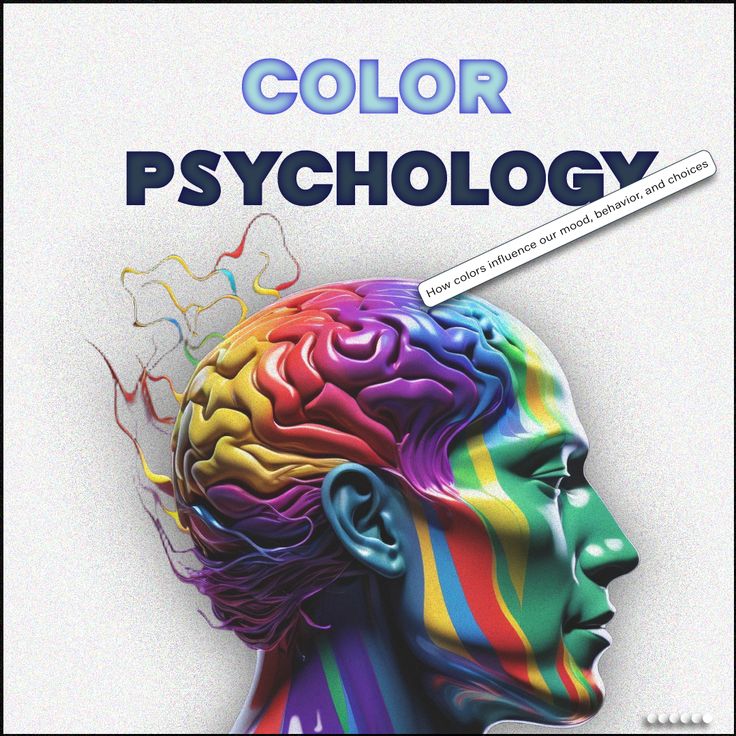
Color plays a pivotal role in shaping our emotions, influencing our mood, and creating ambiance within different spaces. Understanding color psychology is essential when selecting paint colors for various rooms. Each color evokes specific emotional responses and can dramatically alter the atmosphere of a space.
For instance, the color blue is widely recognized for its calming and serene effects. It is frequently associated with tranquility and is often used in bedrooms and bathrooms to create a soothing environment. The cool tones of blue can lower heart rates and reduce stress, making it an ideal choice for relaxation areas. Consider using soft pastel blues for a gentle touch, or richer navy blues for a more sophisticated elegance.
In contrast, red is a color that symbolizes energy and passion. This vibrant hue is known to stimulate feelings of excitement and enthusiasm. It is particularly effective in dining rooms or social spaces where interaction and conversation are encouraged. A bold red accent wall can create a lively focal point, igniting energy and warmth in an otherwise neutral room.
Yellow represents happiness and optimism, often evoking a sense of cheerfulness. This color can brighten a space and is perfect for areas like kitchens or playrooms where positivity is desired. Incorporating yellow through subtle accents or lighter shades can ensure a joyful ambiance without overwhelming the senses. The right application of yellow can uplift the mood and inspire creativity.
Incorporating knowledge of color psychology into your paint selection can enhance the living experience, making each room reflect its intended purpose while catering to emotional needs. By thoughtfully choosing paint colors, homeowners can create harmonious environments that resonate with comfort and functionality.
Consider the Purpose of Each Room
When selecting paint colors for various rooms in a home, it is essential to consider the primary purpose of each space. Color psychology indicates that different hues can profoundly influence emotions and behaviors, which is why choosing the right paint color is vital. For instance, bedrooms serve as sanctuaries for rest and relaxation, which makes calming colors incredibly effective. Soft hues like light blues, greens, and lavenders not only promote tranquility but also help in creating an inviting atmosphere conducive to peaceful sleep.
In contrast, areas such as playrooms benefit from more vibrant and playful colors. Bright yellows, oranges, and reds can spark creativity and energy, making them ideal for spaces designated for children’s activities. These cheerful shades create an exciting environment that encourages play and imagination. However, it is important to balance vibrant tones with elements of moderation to avoid overstimulation.
Living areas and dining rooms typically serve to foster relaxation and conversation. Neutral tones such as soft whites, beiges, and greys allow for flexibility in decor and can make a space feel larger and airier. These colors create a tranquil backdrop that accommodates various furnishings and styles while maintaining a sophisticated ambiance. Additionally, the right accent colors can be introduced through decor accessories to add warmth and personality to these spaces.
Ultimately, understanding the functionalities of each room can guide homeowners in selecting paint colors that complement their lifestyle. Identifying the primary use of each room enables the selection of colors that not only enhance its purpose but also create a seamless flow throughout the home. By carefully considering the needs and activities of each space, one can achieve a harmonious environment that resonates with its occupants.
Lighting and Its Impact on Color Perception
When selecting paint colors for your home, it’s essential to consider how different types of lighting will influence the appearance of those colors. Lighting can dramatically alter the perception of hues, making a color appear warmer or cooler, brighter or duller. Understanding the four primary types of lighting—natural light, incandescent, fluorescent, and LED—can significantly assist in making an informed choice about your paint selections.
Natural light, which varies throughout the day, tends to show colors in their true form. During the morning and late afternoon, the quality of daylight can cast warmer hues, whereas, around noon, it appears more neutral. In contrast, incandescent lighting emits a warm, yellowish light that can enhance warm colors like reds and yellows while potentially muting cooler shades. When considering a color for a room primarily illuminated by incandescent light, take note of how the paint interacts with its warmer tones.
Fluorescent bulbs, on the other hand, provide a cooler, bluish tone to the light spectrum. This can create a stark contrast with warmer paint colors, often making them appear shadowy or muted. When choosing paint colors for spaces like kitchens or basements that might utilize fluorescent lighting, opting for colors that are more neutral or cool can yield a more balanced and appealing effect. LED lighting is versatile and increasingly popular, as it provides a broad spectrum of colors, which can be adjusted to mimic both warm and cool light.
Given the diverse impacts of these various light sources, it is crucial to test paint samples in the actual lighting of the room before making a final decision. Viewing samples in different times of the day will help you see how the color changes and ensures that your chosen paint color harmonizes beautifully with the room’s lighting conditions.
Choosing a Color Scheme: Monochromatic vs. Complementary Colors
When undertaking a painting project for a room, two primary color schemes emerge as popular choices: monochromatic and complementary. Each approach offers unique characteristics that can contribute to the overall aesthetic and ambiance of a space, making it essential for homeowners to understand the fundamental differences between them.
A monochromatic color scheme revolves around variations of a single color. This method can create a serene and cohesive look in any room by incorporating different shades, tints, and tones of the same hue. For instance, a room painted in varying shades of blue – from a deep navy to a soft sky blue – can evoke a sense of tranquility and spaciousness. When selecting the variations, consider using a light hue for larger areas and darker shades for accents, which can help create depth without overwhelming the space.
In contrast, a complementary color scheme involves using colors that are directly opposite each other on the color wheel. This approach can yield a vibrant and dynamic atmosphere, as it pairs contrasting colors to create visual interest. For example, pairing shades of green with reds can stimulate energy and contrast, making the room feel lively and exciting. However, it is vital to strike a balance when utilizing a complementary palette to avoid clashing colors that might lead to visual chaos.
To achieve a harmonious design, consider incorporating neutral tones as a unifying element with either scheme. Neutrals can help balance more intense colors, ensuring the overall space does not feel overwhelming. Additionally, when selecting decor or furnishings, ensure they align with your chosen color scheme to maintain cohesiveness throughout the room. The key lies in understanding how these color strategies can affect mood and perception, ultimately leading to a well-designed and inviting living space.
Seasonal Inspiration: Adapting Colors to Fit the Time of Year
The changing seasons present a unique opportunity to transform the ambiance of our living spaces through color. Each time of year offers distinct emotional and aesthetic qualities, allowing for the thoughtful adaptation of paint colors to create a harmonious environment. In winter, warmer tones can instill a sense of coziness and comfort. Rich hues like deep reds, warm browns, and soft golds not only evoke warmth but also make a room feel more inviting. A perfect way to incorporate these colors is to select a bold accent wall that can serve as a focal point, enhanced by soft furnishings and decor that echo these inviting shades.
As spring arrives, there is a natural inclination to embrace lighter, refreshing colors that reflect the awakening of nature. Soft pastels, such as pale pinks, muted greens, and light blues can rejuvenate a space, infusing it with energy and clarity. Paint options for spring could involve using these lighter shades throughout the room or integrating them into strategic accents, perhaps with a few well-placed pieces of artwork or seasonal decor. Pairing pastel walls with vibrant pillows or floral arrangements can create a refreshing continuum from inside to outside.
Summer lends itself to vibrant accents, with bright colors such as sunny yellows, bold corals, and lively aquas. These hues can brighten any room, bringing an element of cheer and vibrancy. Consider painting an accent wall in a vibrant shade or switching out decor items for their seasonal counterparts, such as incorporating seaside themes or botanical elements that celebrate the warmth of summer. The key is to balance these lively tones with neutral furnishings to avoid overwhelming the space.
Overall, adapting paint colors to align with seasonal shifts not only enhances the aesthetic appeal of your home but also enriches your emotional experience within it, creating an environment that consumes with the essence of each season.
Utilizing Samples and Swatches Effectively
Choosing the right paint color for a room can feel overwhelming, but utilizing paint samples and swatches effectively simplifies the process. First, acquire a selection of paint samples from your local hardware store. These samples are typically available in small containers, allowing you to test various shades without committing to a particular color immediately. Make sure to select a variety of colors that you feel might complement your existing decor.
When testing paint colors, it is crucial to apply swatches in the actual environment where they will be used. Purchase a few small brushes or foam applicators and paint patches on the walls of the room. Ideally, create swatches that are at least a square foot to showcase the color properly. This method will help visualize how the color interacts with light and the room’s dimensions. Consider painting swatches on different walls to observe how light affects the color throughout the day. A color that looks appealing in the morning might appear quite different in the afternoon or evening due to changing light conditions.
Furthermore, take note of the furniture, flooring, and decor when evaluating your chosen colors. The surrounding elements will affect how the paint color is perceived within that space. To facilitate this comparison, observe the same color next to various items in the room and in various natural lighting. It is also advisable to let the painted samples dry completely, as wet paint can appear darker or different than it will in its final state.
After you’ve tested several swatches, take your time to evaluate each option. Discuss with family members or consult with a friend to gain different perspectives. Ultimately, this careful approach will lead to a more satisfying choice of paint colors that elevate the aesthetics of your space.
Incorporating Trends While Staying True to Your Style
When it comes to choosing paint colors for your home, it is essential to balance current design trends with your individual style preferences. The world of interior design continually evolves, presenting new color palettes that often captivate and inspire homeowners. However, the key to creating an inviting environment is to select shades that resonate with your personal aesthetic.
This year, some of the most popular paint trends include earthy tones, soft pastels, and bold jewel colors. Earthy tones such as soft greens and muted terracottas can create a grounded and tranquil atmosphere, making them ideal for spaces like living rooms or bedrooms. On the other hand, soft pastels can brighten areas and add a sense of lightness, making them a popular choice for children’s rooms or creative spaces. Bold jewel tones, including deep blues and rich emeralds, can also provide a dramatic flair when used as accent colors or in smaller rooms.
While these trends offer a variety of choices, it is vital to ensure that the colors you select are authentic to your personality. Your home should reflect who you are and provide comfort to you and your family. When deciding on a color scheme, take into account the existing furnishings, decor, and natural light in your space to ensure cohesion. It can be helpful to create a mood board containing swatches of paint, images of furniture, and other decorative items to visualize how different colors will interact.
Ultimately, incorporating trends should serve to enhance your home’s aesthetic rather than dictate it. Select colors that feel comfortable and true to your identity; this way, you can create a harmonious environment that remains stylish yet personal. Choosing the right paint colors can help achieve a perfect balance between contemporary trends and your unique taste.
The Role of Trim and Accents in Color Selection
When it comes to interior painting, the selection of wall colors is influenced significantly by trim and accent colors. Trim, including moldings and baseboards, serves as a vital element in unifying the overall aesthetic of a room. By coordinating trim colors with the shades of the walls, homeowners can create a cohesive look that enhances the beauty of the space. Neutral trim colors, such as whites and grays, often act as a perfect complement to bolder wall colors, allowing the latter to stand out while maintaining a sense of balance.
One effective way to incorporate depth and interest into a room is through the use of accent walls. By painting one wall a different color than the others, homeowners can draw attention to architectural features or create a focal point within the space. Selecting a specific shade that complements the overall palette or echoes the trim colors can enhance visual harmony. For example, if a room features white trim, a rich navy accent wall can provide a striking yet sophisticated contrast. This approach works particularly well in spaces such as living rooms or bedrooms where creating an inviting atmosphere is essential.
Moreover, the integration of trim and accents does not have to be limited to colors. Textures and finishes play a crucial role too. A satin sheen on trims can create a subtle shine that elevates the overall elegance of the room, while a matte finish on the walls can create a soft, warm environment. Therefore, when choosing wall colors, it is also important to consider how they will interact with the textures and finishes of the trim and accent elements, ultimately leading to a well-designed space that offers both depth and visual appeal.
Finalizing Your Choices: Expert Tips for a Flawless Finish
Choosing the right paint colors for your home is an intricate process that involves careful consideration. As you finalize your selections, it is crucial to ensure that the colors you choose not only complement each other but also flow seamlessly throughout your living space. This interconnectedness helps create a cohesive atmosphere within your home.
A practical approach to achieving this is to evaluate your color selections in the context of your entire home layout. Consider how each room connects to the others and how light interacts with the paint colors at different times of the day. Not only will the lighting affect the hue, but it also influences the ambiance. Therefore, testing your final choices with actual paint samples on the walls is recommended. Observe how they appear in morning light, afternoon sunlight, and evening shadows to get a well-rounded assessment of the colors.
Additionally, timing plays a vital role in applying paint. It is advisable to schedule the job when natural light can adequately guide your work and help you achieve optimal results. If painting outdoors is part of your plan, be mindful of weather conditions that might affect your application process. Moreover, starting in smaller areas can help you hone your technique and ensure an even application throughout the selected spaces.
To achieve a professional-looking finish, using high-quality brushes and rollers tailored to your specific paint type is essential. This attention to detail ensures a smooth texture and reduces the likelihood of streaks. Finally, remember to take your time and allow each coat to dry properly before applying the next. These expert insights will allow you to finalize your choices with confidence, leading to a beautifully painted home that reflects your personal style.